Where Most of the Playtime for your Game Comes From (14 Game UI/UX Design Tips)
//It influences how players will view the rest of your game.

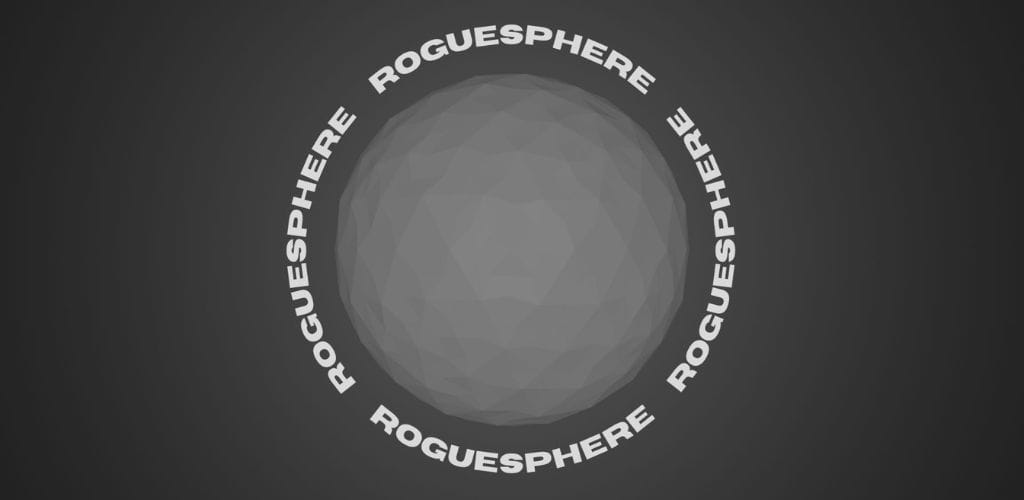
Roguesphere
Shove foes and conquer worlds with one finger.
The whole universe is against you, but you fight anyway. Travel around planets, smash through anything in your way, and get back up no matter what.
//Intro
The user interface (UI) makes the first impression.
It influences how players will view the rest of your game.
And most of your players will only get to experience about a 1/3 of your game (a data from Steam).
If that's really only what of most your players get to experience, then MOST of that is just the UI (the loading screen, the main menu, the inventory, and so on).
Yet, most developers (including myself) under appreciate UI and treat it as an afterthought that we throw together near the end of development.
This needs to change though.
It's an important part of game development and is as much part of the final product as everything else.
It has an impact not just on the way your game looks, but also with how it works and feels overall.
There's a reason why people get hired for UI and UX work.
It's abstract and is one of those things that you can go back and forth with forever without ever really feeling like you absolutely love the end result (at least I feel this way).
With all that said, here are some tips that I sort of use as a checklist to help guide me when I work on UI for my games.
There is no order of importance with the tips here.
I'll start with the few most actionable tips I have first.
//Actionable UI/UX Tips
1. Get inspired
Open the apps that you like to use and that you feel are well-designed and copy whatever makes sense for your game.
This app doesn't have to be another game.
As an example, I copied the colour palette, and some of the layout from the financial app WealthSimple for my financial education game, Rainy Day.
There's plenty of digital design resources such as Dribbble for general design and Game UI Database to help inspire your UI, but even the art on a wine bottle could inspire your design.
Inspirations are everywhere so make sure to look outside of just video games!
2. Storyboarding / Wireframing
Once you've found inspirations and have some sort of direction of what you want to do for your game's UI, the next most actionable step is to start sketching.
Sketching will save you a lot of time.
It's a faster way to iterate on your designs rather than actually implementing them on any game engine, framework, and or writing any code.
There are software available out there like Figma or Adobe XD to help you create more sophisticated wireframes, but I feel like that breaks the point of wireframing.
Those are just tools for you to know, but just keep in mind that the whole point is to just create a simple mock up of your designs before starting to actually implement anything.
So, during this process, I keep it very simple.
I use placeholders like squiggly lines for text and basics shapes for buttons or any other game object.
The closer you nail down your mockup, the less pain you will have when you actually implement it.
Your mockup and even your final design will never be perfect though, so know that balance of when to stop and keep progressing.
Here are some wireframe examples from my games.
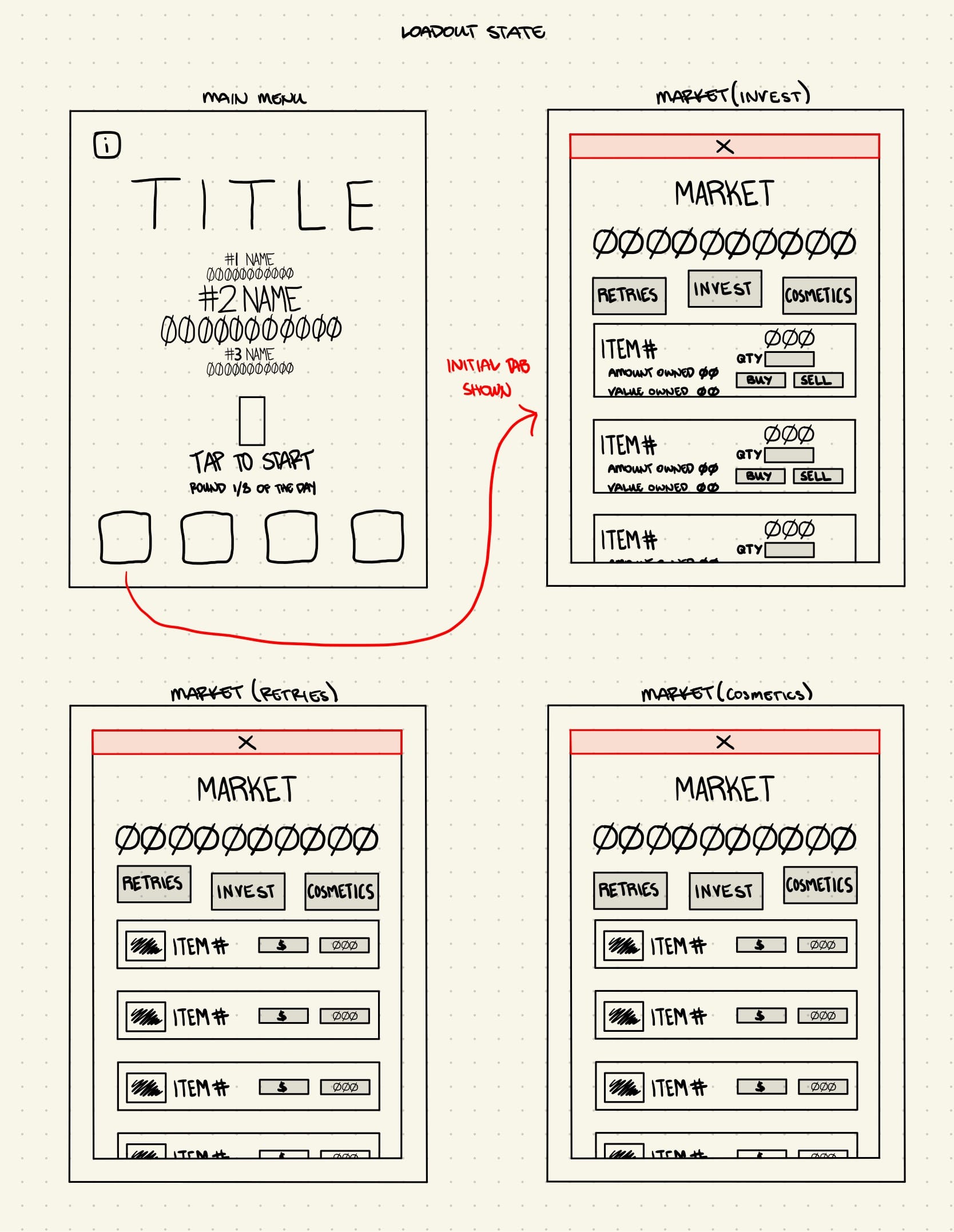
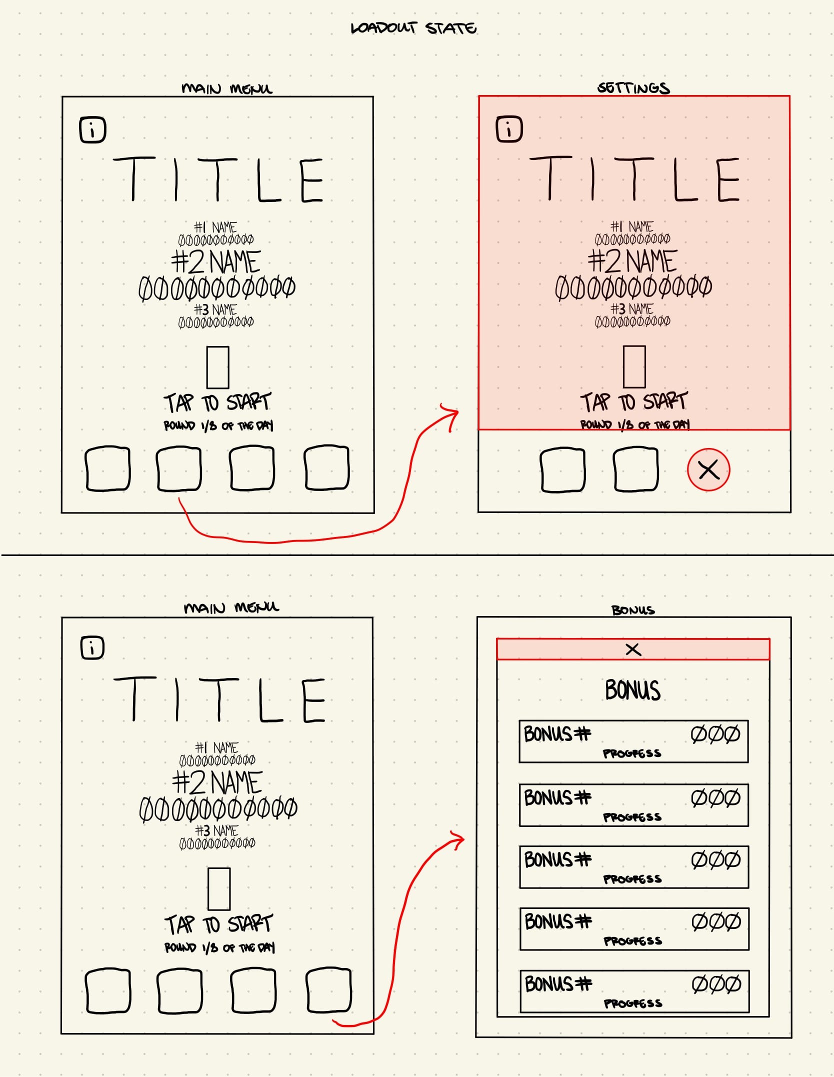
Two pages for when I was developing Rainy Day
3. Have it in tandem with everything else during development
If you don't already have some sort of direction for where your UI is going, the straightforward actionable tip I would say is to start dedicating some more time for your game UI throughout development.
So, that means that... if you don't already have a mockup and are kind of lost with UI, it's best for you to put some time in on your UI as soon as you can.
Just throwing in buttons or texts in random places of the screen temporarily and worrying about them later is a good way to create a lot more unneeded stress around your game.
Game development already has a lot of unknowns, which can be quite stressful.
We don't need to create more stress, especially if it's something that we could somewhat control and come up with some sort of plan for.
UI isn't an afterthought to leave for the end of development and instead should be iterated on as you work on your game just like all the other parts that comes with game making.
You'll always need to be adapting your UI to any significant changes that take place in your game, but developing completely blind is a different topic.
//General UI/UX Tips
Now, for the more general tips.
4. Design for the platform (understand the hardware)
Design for your game's platform.
If you're making a mobile game for example, you have options for designing controls based on tapping, swiping, and or tilting.
So, the best design for the mobile platform is to design around those features instead of cluttering the screen space with lots of virtual buttons that make up a typical game controller.
There are plenty of successful mobile games that have more than one or two action button controllers on their screen though. The difference though is that they generally put a lot of thought with the placement of these buttons to still give a good player experience.
I've wondered how the game Downwell would be if I were to just be able to tilt my phone to move and have tapping be the jump or shoot control.
But, instead, it has three buttons: moving left, moving right, and a dual purpose jump or shoot button, which are all placed at the very bottom of the screen.
So, the design still worked out because the buttons themselves didn't really block anything important from the game and pressing on them doesn't really cause your fingers to block anything important in the game either.
If people can buy your game on Steam and they hook up a game controller to play and it's functional, you wouldn't want a keyboard prompt to show up in your game as another example.
Understand the platform where you will be releasing your game and the hardware that players will be using to play your game, then design with both of those in mind.
5. Multiple resolutions
Next quick tip is to design your UI to suit different resolutions and screen sizes.
Players could be on many different devices and screen resolutions, so ideally you would want everything seen on the screen to adjust accordingly to all the devices that can be used to play your game.
It's difficult to account for everything and more and more different devices will come out.
But, again, when you make it a habit to check in on your game UI throughout development and test things such as how it looks on multiple different screens, you will save yourself a lot of pain later on from tedious work.
6. Plan ahead
Planning your UI ahead for features that you want to add in the future is also another way to save yourself a lot of pain later on.
Games like Plants vs. Zombies prepare the UI placement of their upcoming new world as an example.
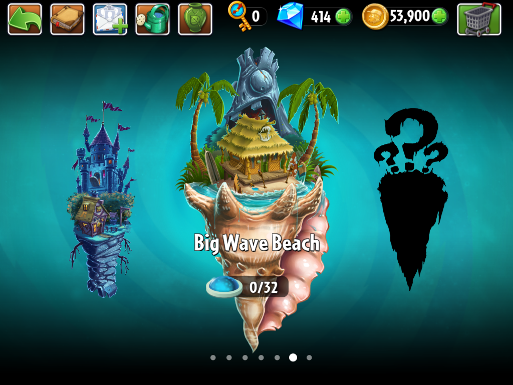
Not only does this prepare those features for implementation, but it also gives your players something to look forward to in the future.
7. Accessibility > Aesthetics
Now, one of the most important parts of developing UI is accessibility.
It's better to have basic and flat UI than to have a poorly executed design that is supposedly in the art direction of your game.
When it comes down to it, it doesn't matter how beautiful your design looks if it's not usable.
So, other than making sure your game is playable on different systems, you also need to account for how usable your game is to as many people as possible.
This is so much more than just providing your players the ability to adjust the volume and translating your game to multiple languages.
Those are almost the bare minimum, including features like allowing your players to customize different UI elements, such as color and size, and toggling options such as vibration and pop-ups on or off.
Again, those are just the high level things you could at least include your game (they're easy) and this topic really deserves its own separate post.
But, to open a curiosity loop and increase awareness of inclusive game design, I want to touch briefly on the different categories to consider with accessibility and the things you could do to give most of your players a great experience with your game.
- Motility - include players with varying motor abilities by providing options for different input methods and control schemes
- Vision - include players with visual impairments by giving options for adjust text size, contract, and colour schemes
- Hearing - include players who are deaf or hard of hearing by providing alternative auditory cues such as visual cues or subtitles
- Speech - include players with speech impairments by providing alternative methods for communication and interaction within the game such as text-based chat or gesture-based commands
- Cognitive - include players with diverse cognitive abilities by making your game easy to understand and get into with clear instructions
8. Frictionless (Less is More)
We can only process and juggle a limited amount of information in our brains so you have to limit how much UI you show all at once.
Less is more.
Display information only when needed.
Make use of visual hierarchy.
When you need to show multiple information all at once, ranking each of them from most to least important and then arranging them accordingly to what your players should be looking at in order is a good way to keep a nice flow.
So for example, a bold title text at the top will usually be read first before whatever is below.
Each addition you make into the screen space adds more visual noise and cognitive load.
This is why it's again important to have UI be a part of the process all throughout the development of your game, because it will take time to iterate and find out what needs to be shown at all times, where, and when.
The main goal is to ultimately immerse your players to your game and not have them go through a swamp of UI.
9. Immersive (Diagetic / Fast Hook)
Try to bake the tutorial in slowly in different chunks and make the feel of your game as natural as possible.
Player attention is valuable.
We have a tiny window to immerse them, so you have to get them engaged with your game as soon as possible without much UI getting in the way.
Every time there's a UI element in the screen that makes your player pause, you remove the player from experiencing your game to deal with it.
I want to emphasize the try and as much as possible parts of the things that I'm saying here, because it's not always possible for some games to not pause the game at all to convey something.
Sometimes player will just need to read lots of text, especially if it's a narrative game for example. What could help in designing that though could be to break text up into smaller sentences and have the player still interact with the game by pressing a button or something to read on through.
The other thing that could help with player immersion is by having UI that exists physically in the world of your game, which are called Diegetic UI.
A popular example of this is Dead Space, a lot of its UI is built into the game's world, such as the ammo counter displayed on the guns themselves and the hologram projection used to show the player's inventory.
Again, this doesn't always make sense for all games, so it shouldn't be done just for the sake of your game looking cinematic or immersive.
It's just all about being clever with how you present information.
What overall matters is how accessible everything is for your game and how usable it is.
10. Leverage familiarity (Affordances)
What helps the usability of your UI design are affordances and taking advantage of familiarity.
It helps to make your designs immediately understandable, intuitive, and your game overall easier to play.
So, if your players need to move in your game using a keyboard as an example, it would be a lot more intuitive to use the arrows keys for that.
It just makes sense.
This goes hand in hand with familiarity.
So, using the same example I just gave you for player movement, you could also use the WASD keys for that as well because it has become widely known in the gaming culture.
Similar to how a back button is usually at the top left of an interface.
There's something to be said about evolving and advancing UI design, but knowing what the conventional way of doings things are FIRST before breaking the 'rules' is a good idea.
What matters is usability.
Making use of affordances and what's familiar helps your UI with that.
11. Consistency and theme
The next tip is to create consistency in your UI, which ties into the familiarity point above.
Stick to a colour palette.
Stick to a specific spacing.
Stick with the same few fonts.
Stick with the same navigation.
Stick with a design pattern for where elements are placed.
Having a consistent theme is the key because it helps create and maintain flow.
The last thing we want to do is interrupt that flow.
So, if a button were to be introduced to a player at the bottom center of the screen, we don't want to all of a sudden have it in a different place unless its an actual game mechanic.
To help you with sticking to a colour palette, I personally use free tools such as Coolors or Adobe Color
For fonts, I get mine for free from Google Fonts and it's actually a good resource for icons as well.
12. Add feedback
Whether it's vibration on the controller or an animation that happens when your players presses on a UI element, any sort of feedback that you provide them can improve their overall experience.
Keyword can because again you have to think about accessibility always.
One feedback mechanism you provide say a flash on the screen could be okay for some players, but could be bad for others because it can trigger seizures.
So, that's why it's important to have multiple ways of conveying feedback instead of just one and to have feedback mechanisms like this in the settings for players to toggle on or off.
We're talking about the subtle mechanism that will juice up your gameplay and really add polish and it's really exciting, but we have to be mindful of our players.
It's more than just about making your UI from looking and feeling good.
13. User testing
Every design decision goes back to thinking about your players.
Sure. You can't make your game to satisfy everyone, but it's on us as the designer when someone misuses our UI.
If the misuse is not on purpose, your players are just simply doing how they believe something is supposed to be used.
That's why it's important to not only apply the tips I've given you (affordances, the visual hierarchy, theming, etc), but to also continually test your UI with both yourself and your players.
There's so much information that other people can provide you that you may not be able to notice or see just because you can get accustomed to your work.
There's a balance with this though because no. Customers are not always right.
Some playtesters could be giving you evil data.
In a perfect world, you will only get good information, but in reality some of the results you get back could mislead you to a worse game.
How do you avoid it?
- Don't explain anything to your testers
- Have diverse testers with different gaming experience and ages appropriate for your game
- Always filter feedback that you get (you are the only one who truly knows your game)
Speaking of evil...
14. Don't be evil
Be ethical with your designs.
As you may have been able to tell, there's a lot of psychological things with UI.
As simple as how something is positioned or shaped can have a big impact on how your players will perceive the usability of it.
It's powerful stuff really.
and...

So, respect your players and don't try tricking them into clicking for an ad or a buy button.
Well I can't tell you what to do. What I can say though is that doing stuff like that may pay off in the short run, but you lose so much more of the things that matter in life like integrity.
Just be a good person.
//Outro
That's all I have for you in this one.
UI is one of those things where it's mostly about making it less wrong because its just not possible to perfect.
Too many factors are in play.
You won't get rewarded for designing a great UI.
It will just get ignored.
More often than not, it only gets attention when it's bad.
Maybe you want that attention? I don't know.
But, coming up with a good UI is all about making a habit of working and iterating on your it all throughout development.
Coming up with a good game won't come from throwing in UI at the very end.
Renz
1. Get Doaily: a gamified to do list that will help you build a habit of making every day count.
2. Play Roguesphere: shove foes and conquer worlds with one finger!
3. Play Rainy Day: a financial casual education game.
//Supporters
Special thank you shout out to the following ongoing generous supporters of my work, making a difference in the world and mine.
- Laura Milligan
- Andrew Abrook
- Armaigne Rivero
- Fritz Rivero