Upgrades in my Roguelike Without Pauses/Pop-ups
Roguesphere Devlog #15
// Upgrade Pedestals
The new way to get upgrades in my roguelike game builds on top of the idea of smashing enemies into obstacles or throwing them into one another.
Will need to reimplement the row of icons showing upgrades earned somewhere on the screen
This design keeps the energy going and gets rid of the old disruptive popup that pauses the game. (I feel that this is the final iteration for this!)
// Upgrade Information
But, what this new design loses at is the way it presents information about the upgrades pedestals.
The information is integrated in the world rather than a 2D interface on the screen and I made the pedestal always face the player, so it becomes readable when it's in view.
Handling Information Overload
The gameplay is already naturally hectic, but I don't want to overload the screen with information in the heat of the moment.
To prevent this, I made it so that the pedestals:
- spawn far apart from each other (makes the information more consumable)
- show just the upgrade's symbol and have dull colouring when the player doesn't have enough coins to 'buy' it
// Mechanics
I think this new design uses the coin system well and fits in with the mechanics of the game.
If there's not enough coins, it's just another obstacle to play around with to cover yourself from being shot.
Pedestals as objects for cover!
If there is enough coins, it lights up and becomes an obstacle that you can choose to throw to get the upgrade, which when it hits an enemy, causes them to violently explode as well.
Last note, I made it so that going to throw a pedestal resets the combo chain timer as well, because it shouldn't feel like a risk versus reward in that way.
Pedetal Combo Reset Demo
// Conclusion
Here's a sped up video loop of creating the pedestals in Blender.
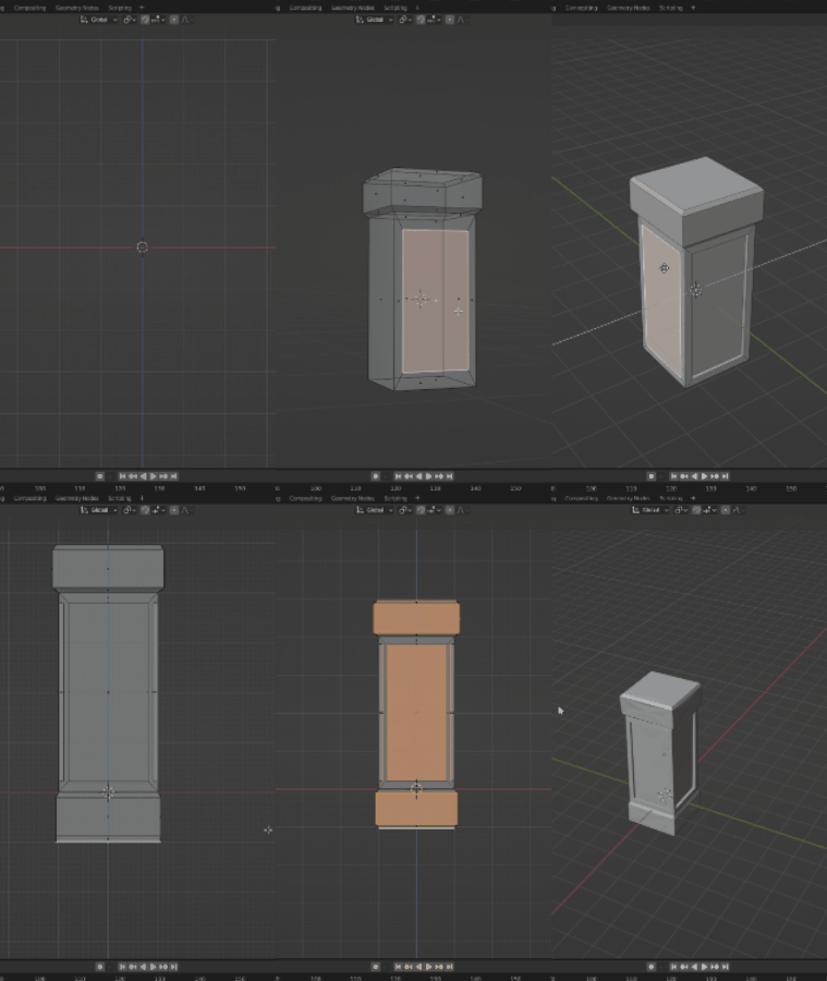
Ohh, in-app purchase pedestal skins maybe?
Any comments about these changes?
– Renz Rivero
// Supporters
Special thank you shout out to the following ongoing generous supporters of my work, making a difference in the world and mine.
- Laura Milligan
- Jacob Huang
- Andrew Abrook
- Faiz Prasla
- Armaigne Rivero
- Joshua Ravasco


