Game Art Styles and Tips for Bad Artists
// Game art for game developers with questionable artistic abilities.
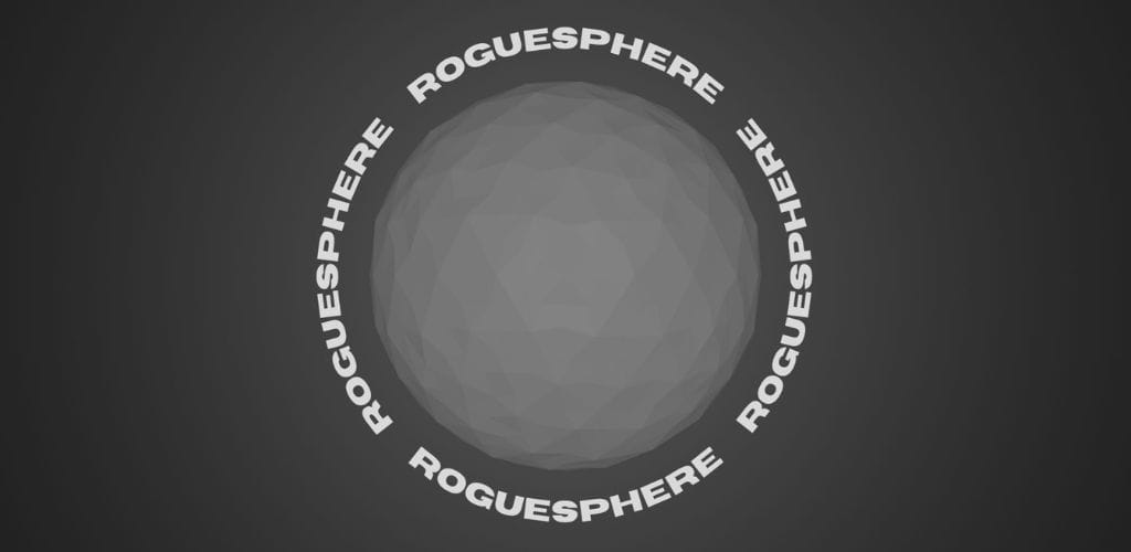
Roguesphere
Shove foes and conquer worlds with one finger.
The whole universe is against you, but you fight anyway. Travel around planets, smash through anything in your way, and get back up no matter what.
People judge a book by it's cover.
The same goes for the game that you're making.
There's a lot of competition and more and more games are being published everyday. The worse looking games will have a worse chance of attracting players.
There are outliers, but that's the harsh truth.
For people to experience the gameplay you've worked hard on, you need to catch eyes on your game.
And the thing is... this is not just about selling out.
There are easier ways to make money other than making games.
Creating visuals is just a part of the game of game development.
I get you though if you feel that you're not really the best at visual art. I felt the same way starting out and I still feel the same way to this day after 3 or so years.
The good news is that there is a path for people like you and I with questionable artistic abilities.
There are basic tips to follow, little techniques, and plenty of beginner friendly art styles you can learn that help hide imperfections.
//6 Basic Tips
1. Basic Shapes
The first tip is to simply just use basic shapes for your game if you really aren't comfortable with your art skills YET.
Use basic shapes like circles, squares, and triangles.
Several games have been successful with this art style.


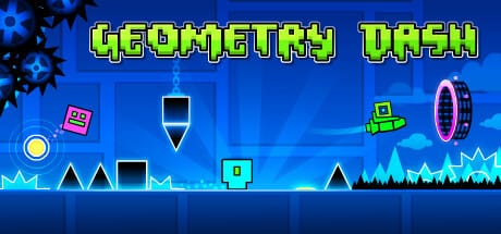
This is one of the easiest art styles that you can learn and happen to be a great building point for the rest of the tips I'll be giving you.
2. Affordances
With the use of basic shapes, you can also easily make use of what's called affordances in general design.
Typically:
- Squares and rectangles are used for platforms
- Triangles for threats like enemies or spikes
- Circles for the player or friendly characters
Why? Because it just immediately makes sense just like how having a bar handle on a door will naturally tell you that you probably pull that bar to open the door.
So, even when you pickup your own art style and start creating more complex game objects, keep in mind its shape, because this gives players subtle cues about them.
3. Contrast
The next tip is just to keep it black and white (literally or not).
Make things easier to see by using a dark colour for the background and a lighter colour for the foreground or vice versa.
4. Colour Palette
If you want to add in more exciting colours and you don't know what you're doing, it's best to stick to a colour palette with a max of only 5 colours.
I use sites like Coolors to generate and look for colour palettes.
The more colours you use the trickier this gets, so stick to 1-2 colours if possible!
With the colours, always just keep in mind CONTRAST.
5. Composition
Next is to purposefully place and arrange objects in your game.
With proper composition of different objects in your game, you can balance screen clutter to create a pleasing look, while directing your player's behaviour and giving attention to an important object in the screen.
As an example, Alto's Adventure composes scenes well by making use of negative space to balance out the scenery, giving attention to the snowboarder, while creating an overall pleasing image to look at.
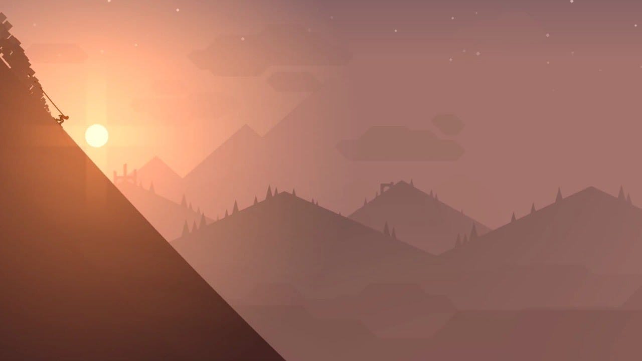
Use of negative space like this also help your game stand out to people when they're scrolling through their phones because it draws attention and help them quickly understand what is going on.
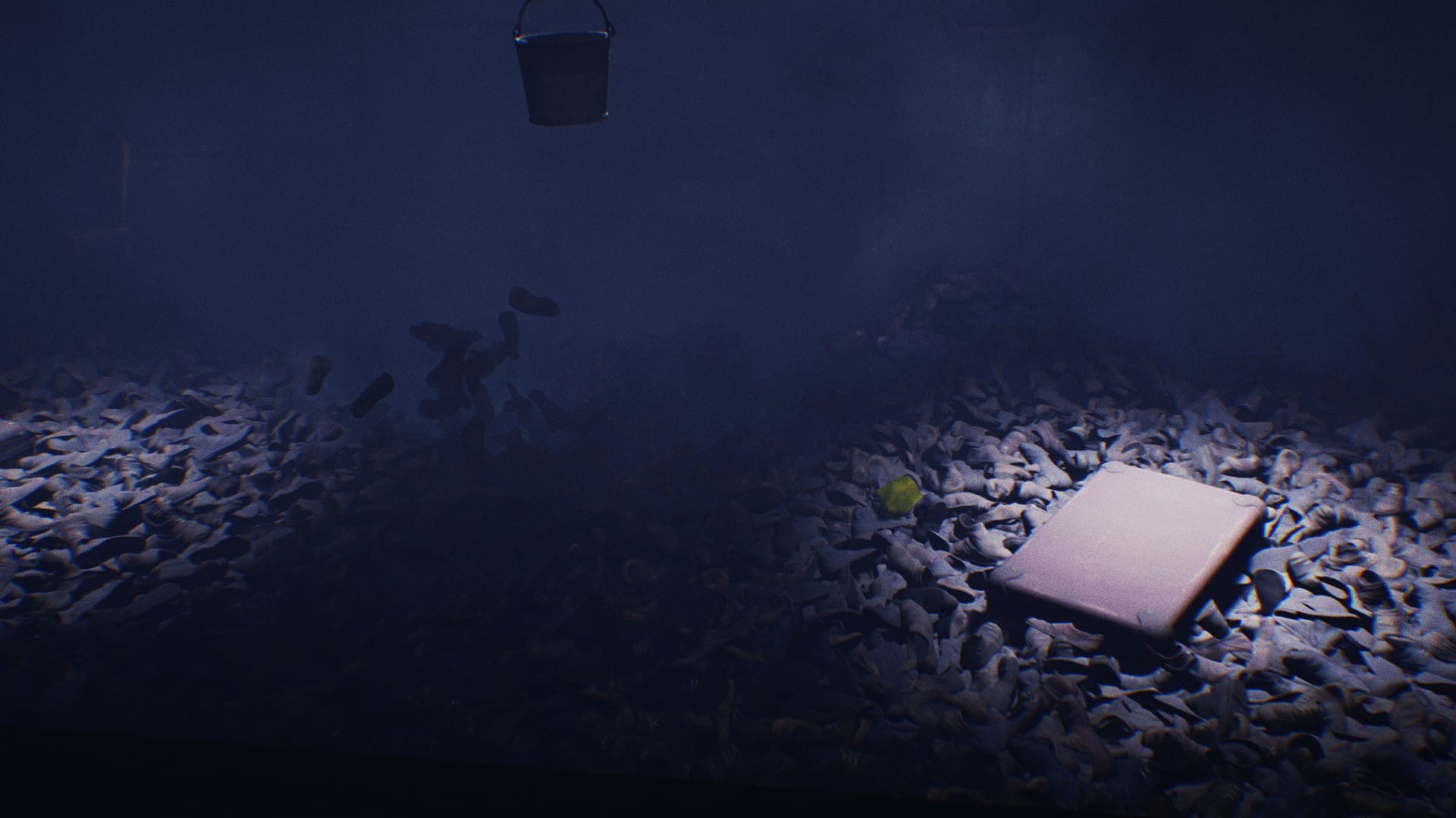
And in many puzzle games, subtle placements of environmental objects are used to clue you in on where you need to go and or what you need to do next.
Just take a look at this scene from the Little Nightmares as an example, different elements most notably the use of luggage to shape a platform and the lighting have been intentionally placed there to direct the player where to go.
6. Consistent Art Elements
The last tip is to keep all the art elements consistent.
It would look pretty weird if you had Mario walking around in Geometry Dash (I guess not if it's a prototype world, but you hopefully get what I mean).
//Your Game Development Art Journey
People dedicate their whole lives studying art and composition.
The best way to lose confidence in making your own game art is by comparing yourself to these people when you should be focusing on yourself.
Hopefully, with those basic tips and examples, you've now pictured what you're capable of making and know the basics of making things look good.
Now, to make this practical... what art skill are you good at or that you naturally enjoy?
If you're really good at any of the traditional visual art skills like drawing or water painting, you can use any of those skills combined with the rotoscoping technique.
I personally used this technique and traced over different Marvel characters to create my own 3D characters for my game Roguesphere.
Here's an example:
And if you're really just wanting to stick with programming, you can stick to again just using basic shapes or even look into ASCII art!
Plenty of games such as the original Rogue game is a perfect inspiration for you.
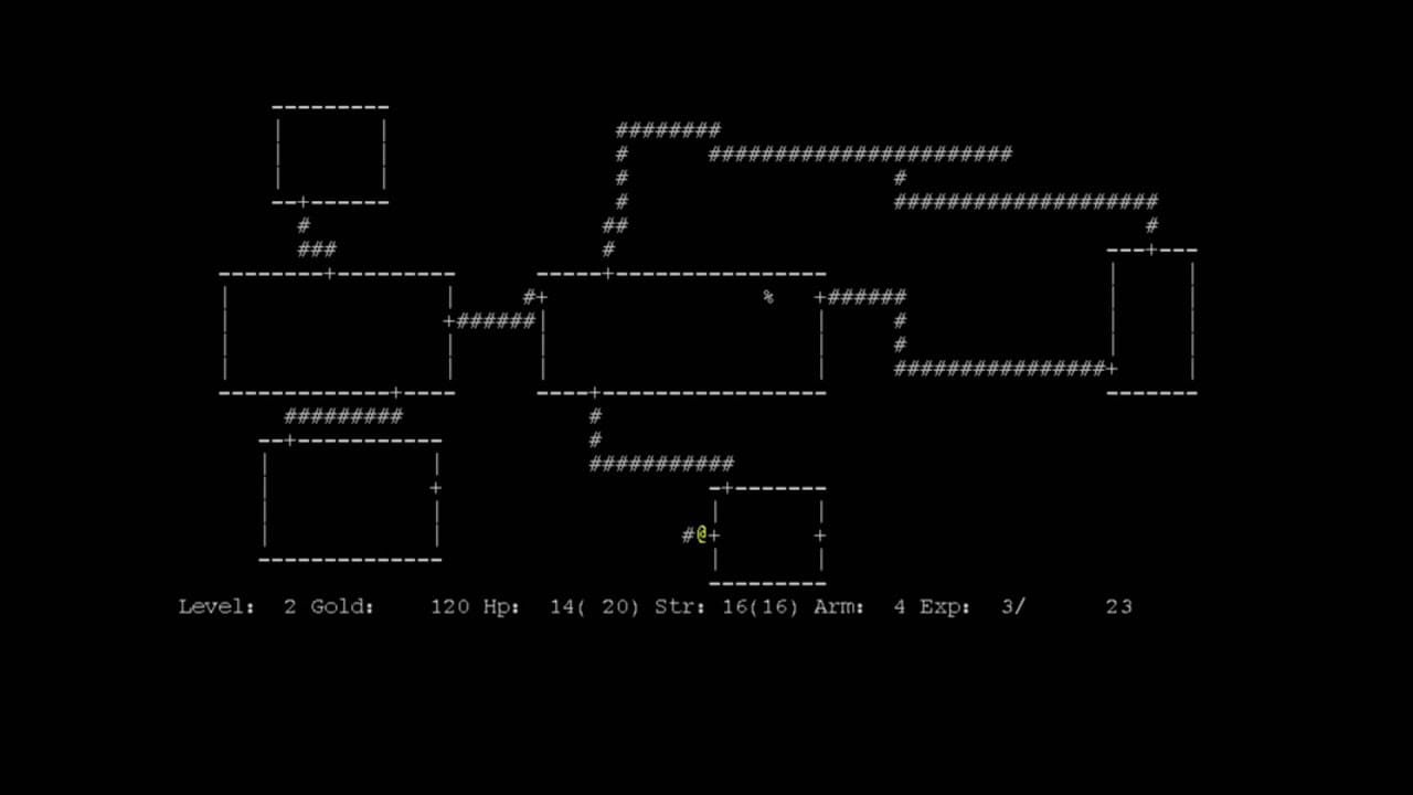
OR... you can take it a step further and even program algorithms to generate art.
Different Art Styles
Here are some of the different beginner friendly art styles and tools you can start learning to create quality art for your games.
2D Art Styles
- ASCII Art
- Pixel Art
- Vector Art
- Tools: Inkscape, Vectornator, Adobe Illustrator
3D Art Styles
- Psx Art
- Voxel Art
- Low Poly Art
Of course, with these art styles, no one is stopping you from including your own style on top of them either.
That's the beauty of art! It IS subjective.
Once you know the basic and sort of the different rules, you can start to break them and play it more risky. Risky in a way that not everyone can understand it right away, but hey you're expressing yourself and it helps you for sure stand out better than using free assets online (duh right?).
With that said, I just want to say that I'm not with the movement of going against using free assets online.
I think you should take advantage of all the resources available to you.
I mean the people hating on using free assets online are using an ASSET (game engine) made for them to create the game they want easier. Like, even the programming language they would use to create a game engine of their own comes from previous work of other people.
It's OKAY to use assets online.
The goal is to have a presentable looking game at the end of the day, but just make sure that you're actually able to commercially use the assets that you find online and the same goes for the AI art that you can generate (it probably came from artists).
//Outro
To wrap up, art is tricky and art is hard.
None of the tips and you picking up an art style will immediately make you amazing.
You will likely have a love-hate relationship as you work on your art.
You will likely hate looking back at the art for your games.
That's progress and you're winning.
It's just how it goes.
Keep going! :)
Renz
1. Get Doaily: a gamified to do list that will help you build a habit of making every day count.
2. Play Roguesphere: shove foes and conquer worlds with one finger!
3. Play Rainy Day: a financial casual education game.
//Supporters
Special thank you shout out to the following ongoing generous supporters of my work, making a difference in the world and mine.
- Laura Milligan
- Andrew Abrook
- Armaigne Rivero
- Fritz Rivero


